

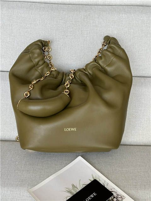

First off, let’s be clear: Loewe isn’t exactly “no logo.” It’s more like… “lots of logos over time, and right now we’re just gonna pretend a cool, geometric one is the *only* one that matters.”
So, you see, way back when – we’re talking mid-1800s – it wasn’t even *Loewe* Loewe, you know? It was just a bunch of leather artisans doing their thing in Madrid. Then this German dude, Enrique Loewe Roessberg, rocks up in 1872 and joins the party. *That’s* when things started getting brand-y, I guess. I mean, they were probably crafting logos even before *that*, but I haven’t actually seen them.
Now, getting to the point of logos. You see, Loewe’s logo has morphed and changed like, a bunch of times. The text I found talks about how each logo reflected a different era, which is, like, so true. I think it’s kinda cool, actually. Shows they’re not afraid to, like, you know, *evolve*. (Or maybe they just got bored. Who knows?)
Okay, so apparently, according to some blog posts I skimmed (shhh!), there are, like, four *key* logos to understand Loewe’s “journey.” But honestly, remembering all those dates and specific designs is, like, way too much effort. I’m not a Loewe historian. I just like their bags.
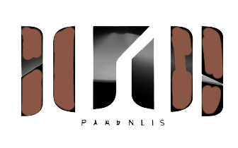
What I *do* know is that now, Loewe is really pushing this one logo, a super clean, almost brutalist-looking thing. It’s, like, two intertwined “L”s, all sharp angles and seriousness. It’s the one you see everywhere now. It’s supposed to be all modern and chic. It’s kinda growing on me, but I still think it’s kinda cold. Like, where’s the *passion*, Loewe? Leather is supposed to feel tactile, warm, and *worn*.
And that’s the thing, right? Loewe is a brand steeped in tradition. They’ve been doing this leather thing for *ages*. So why hide that history? Why act like this clean, modern logo is the only thing that ever mattered? I think it’s a bit of a cop-out. They should celebrate their past logos! Like, put them on t-shirts or something. That’d be awesome!