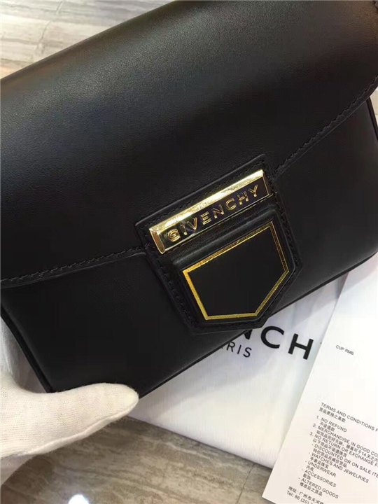

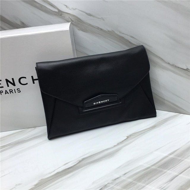

I’ve been diving deep, man. Deep into the internet abyss of Givenchy logos and, like, honestly, it’s kind of a rabbit hole. You see the classic one, the four G’s arranged in this, uh, slightly hypnotic pattern. It’s *everywhere*. And then you start digging, and you realize there are slight variations, different fonts, different arrangements… it’s a subtle but noticeable evolution.
But the weird part is, and this is just my opinion, okay, they could totally ditch the logo. Like, *completely* ditch it.
Hear me out. Givenchy is Givenchy. They’ve got the history, the name recognition, the *vibe*. They’re basically synonymous with, like, effortless chic and a touch of edgy coolness. They don’t *need* to shout “GIVENCHY” from every available surface. The quality, the design, the *essence* of Givenchy speaks for itself, y’know?
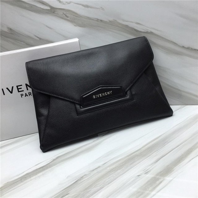
Think about it. Some of their most iconic pieces are subtly branded, if at all. It’s more about the cut, the fabric, the overall *feel* of the garment. It whispers luxury, it doesn’t scream it. (And let’s be honest, screaming luxury is kinda tacky anyway, right?).
I saw this article, I think it was on some random fashion blog, about how brands are moving towards more minimalist branding, a sort of “if you know, you know” approach. And it just got me thinking… Givenchy could be a total trendsetter here. They could go full-on “No Logo GIVENCHY” and, I swear, it would elevate their brand even *more*.
Maybe it’s just me, maybe I’m just tired of seeing logos all the time. But I honestly think Givenchy has the cultural cachet, the design prowess, and the sheer *confidence* to pull it off. It would be a bold move, yeah, but Givenchy has always been about pushing boundaries.