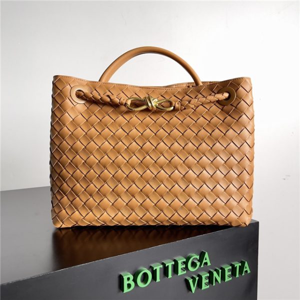
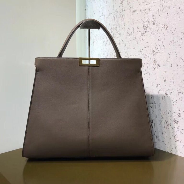
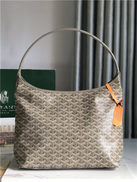
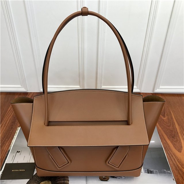
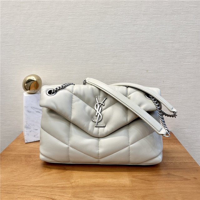
You see all these brands screaming their names from every available surface – Louis Vuitton plastered everywhere, Gucci belts that practically shout “I’m expensive!” – and then you have Bottega Veneta. It’s… different. They’re all about that quiet luxury, that *if-you-know-you-know* vibe.
Apparently, (and I got this from reading a bunch of random web pages – don’t judge my research methods!), back in the day, Gucci Group (now part of Kering, who knew?) swooped in and bought a big chunk of Bottega Veneta. And somewhere along the line, someone clever decided that slapping a big BV logo all over everything just wasn’t their style. Maybe they realized that their woven leather – the Intrecciato – was already their calling card, their secret handshake to the rich and fabulous.
Honestly, I think it’s genius. Their slogan, “When your own initials are enough,”? Pure marketing gold! It’s like, “Hey, we’re so confident in our craftsmanship and quality that we don’t need to scream our name. You know who we are… *if you’re cool enough.*” It’s incredibly elitist, sure, but it works!
I mean, think about it. You see someone carrying a Bottega Veneta bag, and you immediately know it’s Bottega Veneta, even without the logo. It’s like a subtle flex, a whisper instead of a shout. And in a world of constant visual noise, that’s kinda refreshing.
Plus, let’s be real, some logos are just… ugh. Like, some are just plain ugly, or they feel super dated. Avoiding a logo altogether saves you from ever having to redesign it, or worse, having people make fun of it. Smart move, BV, smart move.
Now, I’m not saying that every brand should ditch their logo. Some logos are iconic for a reason, and I can appreciate a well-designed logo. But Bottega Veneta’s commitment to no-logo? It’s a statement. It’s a rebellion against the in-your-face branding that’s become so prevalent. It’s a reminder that true luxury speaks for itself… or whispers, at least.
